You can see my body stats while I sleep
The homepage plots my live glucose, a new reading every five minutes, including while I sleep. This is how I put that chart on the site.
134mg/dL
- in range
- 83%
- below 70
- 0%
- above 180
- 17%
- average
- 145 mg/dL
Glucose 134 milligrams per decilitre, sampled at 4:58pm Eastern. Over the last 24 hours, 83 percent of readings were inside the target range of 70 to 180, and the average was 145.
My glucose, from my own Nightscout. The plot is baked into this page at build, then refreshed every five minutes from /api/glucose while the page is open. Shaded hours are overnight.
You can see my body stats while I sleep. It is the first thing on the homepage: a live chart of my glucose, sitting behind the sentence about what I build, still updating at 3am when I am not performing for anyone.
I thought it would be cool and unique. I have spent a long time in healthcare, where the default is to treat personal information like a biohazard. That secrecy makes sense when it is someone else’s chart. This is my PHI (protected health information), so why not share it?
I wanted the site to read like it belonged to somebody who lives in this body. I meet the definition of a cyborg: a sensor on my arm, a pump, an open-source loop dosing insulin every few minutes.
My A1c teeters around 4.9% to 5.0%, and that number does not tell you what the lows feel like. I have not really shared how I got there. I am starting with the technology I use and what I am building. Fair warning if you stare at it long enough. A normal lunch is a bump. A meal I forgot to bolus is a real spike (oops, whoopsie doodle). Sometimes I sleep on the sensor and you get a compression low, and sometimes the line cliffs to 250 in minutes, out of nowhere. That last one is the sensor falling apart, not my afternoon.
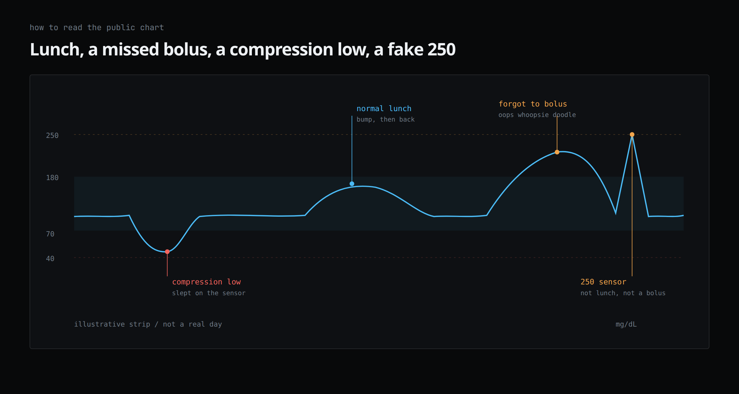
Illustrative, not a real day. The live plot is on the homepage. Learn the shapes before you worry about my pancreas.
The number was already there
Dexcom and DIY Loop have been writing a point every five minutes for years; I already had the history. I needed the public page to show whether its data was current without putting the endpoints my providers use on the public internet.
If the feed is old, the page has to say so. Stale data can stay on screen; it cannot pass as live.
The public site does not talk to Nightscout. A Cloudflare Worker sits in front, caches the last stretch, and serves /api/glucose from this domain. The browser only ever hits my site, so the endpoints my clinicians use do not get hammered because someone left the homepage open overnight.
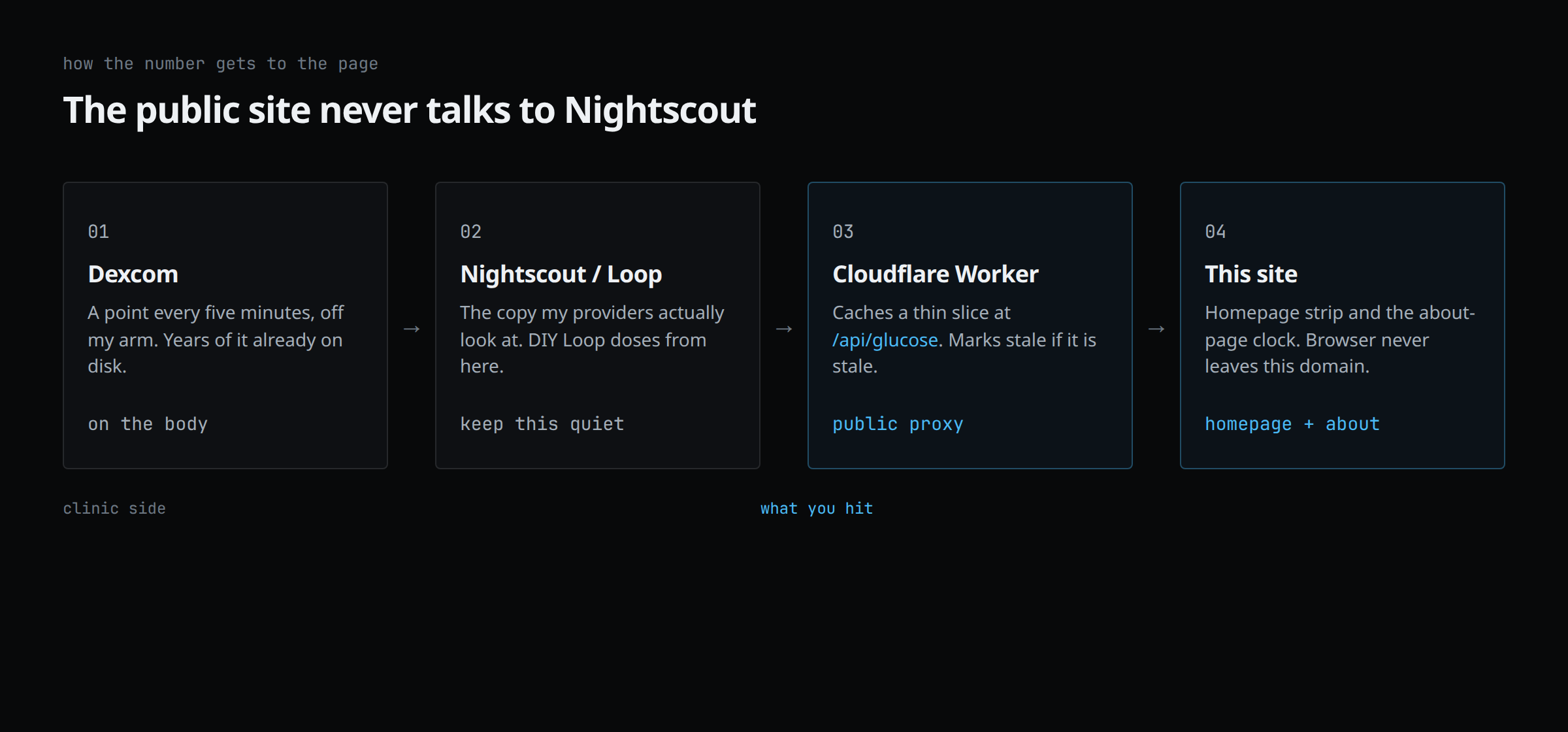
Same five-minute feed. The Worker caches a public slice so Nightscout, the instance my providers use, does not take that traffic.
I did not hesitate. The models did.
Claude, at least with Opus 5, was a pain in the ass for this. After four to six hours of damn verbosity and detours, it started refusing: “that’s a line I can’t cross,” even with me saying this is my data and I am authorizing it. I cancelled the subscription and switched to Codex and Grok in Cursor. They took the request and showed me screenshots and a recording.
Dictate, compare, combine
The models kept trying to add more: extra chrome, another widget, a little glow so it feels “alive.” I ranted into speech-to-text for a good minute and got an instrument instead of a health-app hero.
I start by dictating what I want. Speech-to-text lets you dump the thought before you clean it up. Then I ask for three narrowly scoped mockups so I have something to compare. This is the prompt I keep using through Paseo:
Dispatch 3 finely scoped agents to design mock-ups of the idea. Single artifact, HTML/CSS/JS only. Show me, then I will pick what I like about each and put them together. Use Playwright for screenshots.
I run these agents through Paseo from my desk or phone. I look through the screenshots, pick the parts I like from each mockup, and combine them. I used the same process for the diagrams in this post. Show me the object.
Same day, two drawings
The clock on About came later. It draws the same feed differently. I put a 24-hour loop of my body under the intro because that page is about me.
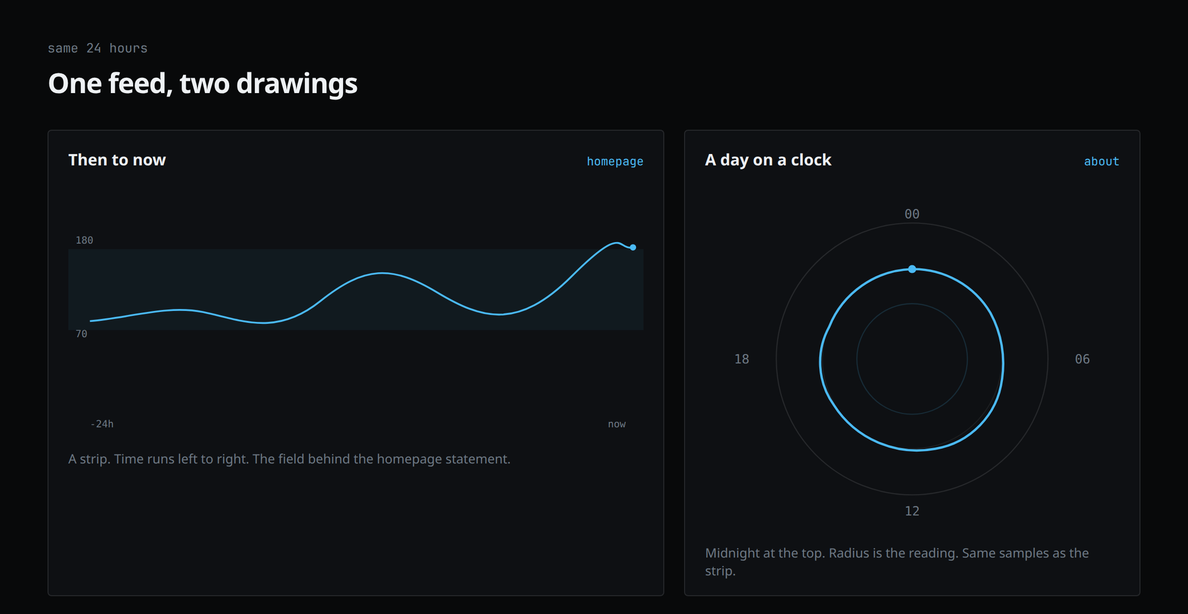
Homepage is then-to-now. About is a day on a clock. Same Nightscout samples.
While I sleep
Living with the sensor and pump is part of who I am, so it belongs on my site. The homepage chart keeps updating every five minutes while I sleep. Go look.